
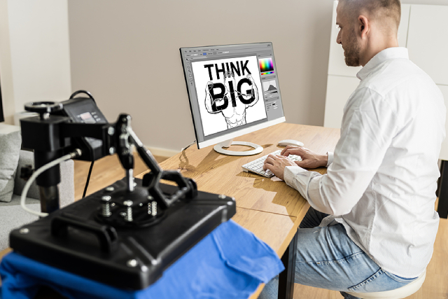
A logo that looks sharp on a business card or a website can turn out blurry, pixelated, or oddly coloured once it lands on fabric. Printing works differently to screens, and a file that renders perfectly on a laptop does not always translate the same way onto a shirt. Getting this right before you send anything to a printer saves time and spares you the cost of a reprint, not to mention the disappointment of opening a box to find your logo looking nothing like you pictured.
The good news is that preparing a logo for printing is not complicated once you know what printers are looking for. A handful of file, colour, and sizing decisions made early on will carry your design through the entire process cleanly. This guide walks through those decisions in plain terms, so you can hand your printer exactly what they need on the first try.
Why Preparation Makes Such a Difference
A logo built for screens is usually saved at a low resolution, since websites load faster with smaller files. That same file, stretched onto the front of a shirt, often turns out grainy or soft around the edges. Printers work with much higher resolution requirements than web design does, and skipping that step is one of the most common reasons a print job disappoints.
Beyond resolution, colour behaves differently on fabric than it does on a screen. What looks like a rich navy blue on your monitor can shift slightly once it is printed, particularly with methods like screen printing that use specific ink mixes rather than the RGB colours your screen displays. Custom T-shirts boost brand awareness for businesses, which is one more reason to get these small details right at the design stage.
File Formats: What To Send Your Printer
Not all image files are created equal when it comes to printing. Some formats hold up beautifully at any size, while others fall apart the moment they are enlarged. This applies whether you are printing a single event tee or handling polo T-shirt printing in Singapore for an entire office of uniforms.
• Vector files (AI, EPS, SVG):
These are built from mathematical paths instead of pixels, so they can be scaled to any size without losing sharpness. If your logo was designed by a graphic designer, ask for the vector version, since this is what most printers prefer.
• High-resolution raster files (PNG, TIFF): If a vector file is not available, a raster image can still work, provided it is large enough and saved at a high resolution. A logo pulled from a website is almost never suitable on its own.
• Formats to avoid: Low-resolution JPEGs pulled from Google Images or screenshots taken from a phone tend to cause the most problems, since they lose detail the moment they are resized.
If you are unsure which format you have, a quick way to check is to open the file and zoom in past 200 per cent. A vector logo stays crisp, while a raster image starts to look blocky or blurred.
Getting the Resolution Right
For printing, resolution is usually measured in DPI, which stands for dots per inch. Most printers ask for a minimum of 300 DPI at the final print size, which is considerably higher than the 72 DPI standard used for web images.
A simple way to think about this is to check the actual print size you need against your file’s dimensions at 300 DPI. If your logo will sit on the chest of a shirt at around 10 centimetres wide, the file needs enough pixel data to hold that clarity at that size, not just when viewed small on a screen.
Colour Preparation: RGB Versus CMYK
Screens display colour using RGB, a system built from red, green, and blue light. Printers, on the other hand, typically work with CMYK, which mixes cyan, magenta, yellow, and black ink. This difference is why a bright, glowing colour on your screen sometimes looks slightly duller once it is printed.
For screen printing specifically, many printers use Pantone colour codes instead of either RGB or CMYK, since these give an exact, repeatable colour match. If your logo has a specific brand colour, providing the Pantone code alongside your file gives your printer the clearest instruction possible, rather than leaving them to guess from how a colour appears on their monitor.
Sizing Your Logo for the Shirt
Print placement affects how a logo reads once it is worn, not just how it looks in a design file. A small, neat chest logo is often the standard for uniforms and corporate wear, while a bold graphic tee can carry a much larger print. A logo that works well as a large centred print might feel cramped or oversized as a small chest logo, so it helps to think about placement early.
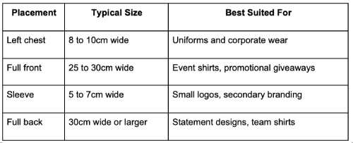
Simplified versions of a logo often work better at smaller sizes. Fine text or intricate detail that reads clearly on a laptop screen can turn into an illegible smudge once shrunk down to fit a sleeve or a shirt pocket.
A Few Small Checks Before You Send Your File
Before handing your logo over to a printer, a short checklist can catch most common mistakes:
• Confirm the file is vector, or a high-resolution raster saved at 300 DPI or above
• Check that any text within the logo remains legible at the intended print size
• Provide Pantone codes if your brand has specific colours to match
• Ask your printer for a digital proof before the full run begins, so you can catch any colour or placement issues early
Conclusion
A well-prepared logo file makes the entire printing process smoother, from the first proof through to the finished shirts arriving at your door. Vector files, correct resolution, and accurate colour codes give your printer everything they need to produce a result that matches what you had in mind, instead of a rough approximation of it.
If you have a logo ready and are looking for a printer who can guide you through the rest, Direct T Shirt offers professional printing services built around getting these details right from the start, so your finished shirts look exactly as sharp as your original design.
